Fall Flowers | Study in Green and Neutral
- filed under: Floral Journal, The Stylish Life
The Color of Fall Flowers
How can autumn be segmented into only warm and colorful palettes?
The various shades of green and neutrals sends the message of autumn in an unexpected way
Daily, we see the fall season repainting the landscape with new faded softer tones. Shades of beige, tawny browns, faded green and so on.
While I do agree the bright autumn shades are very exciting to witness, they often overshadow the cooler colors. Primarily due to red acting as their base color. Since red is the most powerful color in the spectrum, we notice anything red first. Try it out and you’ll see your eye catch the red tones first. Science is at play everywhere, even for designers.
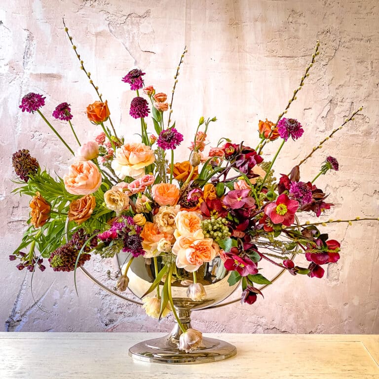
My color tendencies lean toward muted colors. Light Blue is my favorite color followed by pale pink. And of course, it’s my job to bring you the unexpected. Green tends to be the least used color of autumn. How to use it correctly will vary, depending on the application. But in my preferred method of combining classic with some modern influences, the arrangement below came to be. You can see more on this type of study in my Uncommon Autumn feminine Palette
Those gorgeous caramel colored roses are at home in any autumn design.
Yellow is the common undertone for both green and caramel. Using them with green creates a tiny bit of harmony that feels soothing and non-obtrusive.
If you get the sense they look withered, you are correct. I used fading blooms purposefully– I want you to see that even at the end of life, there is something beautiful awaiting these natural elements.
Take a look and study the piece. You will see that the other items are either dead or undesirable in some sense.
Flowers and Elements
Below you will find the items selected and their present state of life
- Montbretia pods are dead– they are normally a variegated brilliant orange and red
- Coco (caramel) roses are at the end
- Green Celosia is dried but only a week past prime
- Millet grass is fading
- De-petaled anemone (yes, like the sea creature) is completely shot but the remaining stem is ideal
- Kangaroo Paws are dead– they are burgundy but more luminescent red when alive
- Green Trick Dianthus, totally alive but passed the 7 day mark
- Blue thistle is almost dead
- Wheat is completely dried as received from vendor
- Green gourd is still in its prime
- Missing: the off-white butterfly anemone which are at their peak and dried green sword ferns
When you study the design, you don’t recognize items as “dead.” You see them used in one beautiful statement. It’s the overall feeling the collection of items create I look for; not beauty of the single item that is needed.
Using multiple layered, well-edited elements correctly is the key to any good design.
Thank you for sharing this space with me.
In love & style,
Petah
Stay Connected with Petah Bashano, Founder of Living Beautifully & Our Social Media Channels
Petah Bashano’s Instagram shares designer knowledge
Petah Bashano’s Youtube Channel for more Living Beautifully design practices.
Living Beautifully’s Instagram for more gorgeous
TAGS:
SHARE THIS POST
better known as “Petah”

Petah’s Carefully Curated Collection of Beautiful Items for your home, yourself or to give.
How to Host a Beautiful Dinner Party
ELEVATES YOUR ENTERTAINING
A complimentary instructional guide written by Petah using his years of event knowledge, designer know-how, planning skills and flair for perfection.
Reserve your Spot on My List
Living Beautifully Just For you
Receive New Seasonal & Entertaining Guides automatically. And… receive 10% off your first purchase. *exclusions apply
Become An LB Insider
Elevate your style
Want to know insider designer knowledge? Become an LB ISIDER and receive complimentary seasonal look-books, designer insider videos and entertaining guides sent right to you.
To join, click below


